Category Archives: Site design

Overall design (eg structure)

uBank: Sorry, Internet Banking is temporarily unavailable.

uBank is an Australian “Internet bank”, in such that they don’t have any branches. That’s fine, they can do everything except deal with cash. They’re owned by the NAB.

They have an app, which gets an absolute bollocking in the App Store. So people use the website instead. I need to do things with that account about once a month.

Close enough to half the time I try to login, I get the error message “Sorry, Internet Banking is temporarily unavailable.” with a page title of “Login Maintenance”. There’s no other kind of banking with these guys. The last time this happened was just before 4pm, which I believe is the close of transactions for that day. Why the hell would you do site changes in the middle of the day, and why just before the close of business? The NAB is a real bank, and I presume it doesn’t pull this kind of crap. They don’t even give a window (“Out until 14:30” or “Down for five minutes”). No post on their FaceBook website saying “there’s a planned downtime this afternoon” or “Sorry for the emergency outage, but rats were chewing on the coolant lines and that just isn’t okay. We humanely hit them with sticks until they stopped.”.

This is a very bad railroad.

Unhelpful web help

Just… just… wrong. So wrong.

FlickrHelp
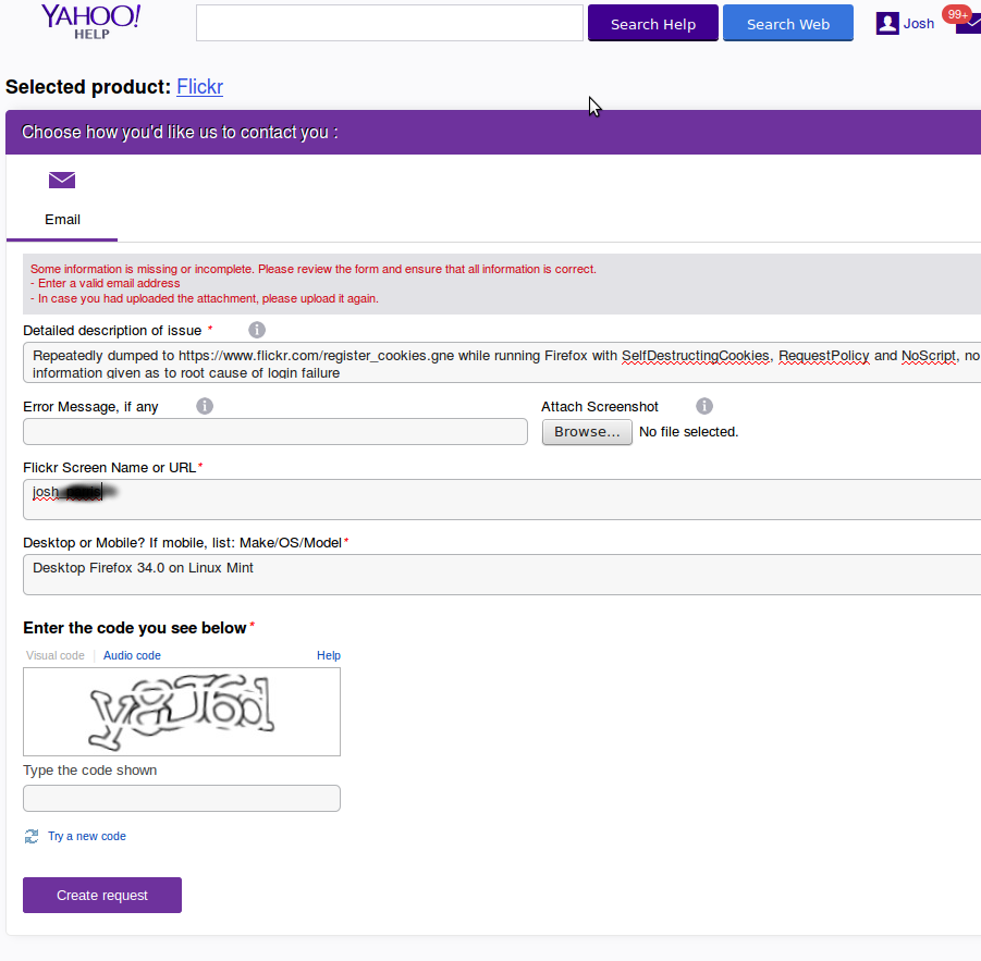
Firstly, note the error message “Enter a valid email addresss”. Where, pray tell, ought I do this?  Why do I need to upload any attachment again?  Why do I have to prove I’m a human time-after-time, when all I’m doing is wrestling with your completely broken attempt at a web form?

Have they noticed that no-one is submitting help requests via this form, what with its refusal to accept said requests?

Dear Flickr: stop sucking balls.

ANZ: The rodeo clowns of online security

For years now I’ve been… less than impressed with the ANZ bank’s concept of how a secure banking website should work. Finally they’ve taken steps to harden their site. They’ve introduced “secret questions”, like “who was your best friend in high school”, “what’s your partner’s nickname” and “what’s your nickname for your youngest child”. At last, my money is now safe from thieves who will never guess that my my partner’s nickname is Cathy, my best friend in High School was Robert, and my youngest’s nickname is Marky. Oh, darn! I accidentally disclosed the answers to those secret questions! It’s as if that information would be widely available to any thief who took the time to look me up on Facebook (don’t bother, I’m not on Facebook).

Because in providing answers to these questions the security on my account was going up, not down, I couldn’t possibly be allowed to opt-out, with dire warnings about being liable for losses if someone found out the answers. To these most basic of questions.

Most other banks have implemented two-factor authentication. Even G-mail has two-factor authentication. But not the ANZ, they’ve stepped things up a notch. They’ve eschewed two-factor, and gone for “You’ll never guess the name of my pet, which I post on Facebook all day long”.

So I took my standard defensive action: attack surface reduction and target-value minimisation. To reduce the attack surface, for each answer I mashed the keyboard – so thieves, remember my first Primary School was in the suburb of pwofkmvosffslkdflsifcmmsmclsefscdsfpsdfpefsdflsd, or something. To minimise the value of the target, I swept all the funds out of the account. What’s wrong the the technique of establishing identity by the production and examination of 100 points of identifying documents?  Why do I need to have a favourite colour?

Cathy worked for the ANZ until recently, and the day she received her final paypacket she shut the account. Hated their account with a passion, but the ANZ is incapable of paying their employees through anything other than an ANZ account. Because, you know, banking is hard.

How not to run a corporate web site

I’ve noticed that Transport For London do this irritating thing: they move (“archive”) their corporate media releases content each month.

So this:
http://www.tfl.gov.uk/corporate/media/newscentre/19678.aspx

— which has been quoted widely as the press release for the Royal Wedding Oyster Card, for instance on the popular Going Underground blog — gets moved to:

http://www.tfl.gov.uk/corporate/media/newscentre/archive/19678.aspx

The old link returns a 404.

WHY? It just seems utterly pointless.

The other thing they do is fail to show, or even link to pictures on their media release pages, even in cases like this where the picture is of prime interest, as the story is “Mayor unveils design of the royal wedding Oyster card”. Instead they make you ring the TFL press office.

Perhaps they haven’t noted the rise of social media, where the messages you put out can be spread by bloggers, Tweeters, Facebookers — none of whom will have the time or motivation to ring your press office to get hold of a photo.

If you hide the official information too much, people will end up relying on the unofficial information out there. Less detail, less reliability, and you’ve got less control of the message you want to put out.

Seems an odd way of doing things in the 21st century.

(I only had this rant because I was looking for a picture of the special Royal Wedding Oyster Card.)

Pressing a button does not demand JavaScript

The state of software produced by web developers is highly variable.  The things the good programmers can do is little short of astonishing, as it always has been with limited environments.  But the bad programmers…

Fifteen years ago I did a Microsoft certification thingy, and now they want me to do a satisfaction survey on it – for no compensation.  I think not.  But I notice an unsubscribe link at the bottom of the email, so I follow it: http://www.mailingsvcs.com/optout.aspx?type=email&optout=1&service=1&networkid=9001&id=josh@example.com&pid=p53457652, see the Submit button, click on it… and nothing happens.  And then I realise – it needs JavaScript to press.  A button, one of those things right at the heart of HTML 2.0.  What is this, amateur hour?  Turns out, yes it is because if you follow the hacked URL above — which if filled with bogus data — and click on the Submit data, the back end proceeds happily without validating any of the data, and asks you another question before confirming that it’s done:

We’re sorry you no longer want to receive e-mails from us. Please allow one week for us to process this request, during which time you may still receive e-mails from us. We apologize for any inconvenience.
To help us improve our service, please tell us the primary reason why you no longer wish to receive our messages:

There appears to be some kind of problem with their computers.  Last time I checked, the time it takes a computer to remove a record from a database is in the vicinity of “I’m already finished”, not one week.

I’m of the opinion that people who construct software ought to be required to put their name on it in a visible way, so they can go on my list of people to smack in the face when I meet them.  It’s for the best.

Myki website suckiness

Having recently used my Myki card for the first time, I thought it best to see how the system had tried to screw me.  At the time I used it, it seemed simple enough, even if it didn’t allow me out of the first gates I tried at Flinders St station and the exit scan took… longer than I would have thought reasonable.  And now, I went to the website to inspect the transactions.  After some fumbling and following unnecessary links, I got to the query page, into which you enter a date range (why it just can’t pull up the most recent transactions by default is beyond me).

Pick an generous date range, to ensure you get all your transactions, and up pops this error:

Please correct the following and try again:

Date to should be less than or equal to current date. Please try again.

It couldn’t just assume that if the user has entered a date range for the future, it will be fine to report all the transactions that haven’t happened yet?  Nor could the system possibly pre-populate the inputs for you to fix things, nor pre-populate before you enter a crazy date like December this year.  Oh no.  That wouldn’t be hostile enough.

Bending to the will of the brain-addled programmers, I complied and got:

Please correct the following and try again:

Up to six months of transaction data will be available.Statement Data only available after 5/11/2009

The first is an assertion, not a problem.  If Statement Data is only available after 5/11/2009, well, just give me that!  Why the controls even offer dates prior to this (two years prior to this) is confusing to say the least.  And why wasn’t this problem flagged along with the last problem?  Why force me to fix “problems” one at a time?

It’s like those crazy Blogger.com comment submission forms, with embedded CAPTCHAs – get the CAPTCHA right and anything else wrong, and you’ve got to keep solving CAPTCHAs until you get the other fields right too.  I’ve already proven I’m a human, you stupid website!

Honestly, you’d think that the people who designed the site weren’t forced to use it until their eyes bleed.  The cards associated with the account – three, one for myself and one for each of my offspring, are all listed as card numbers – even though each card was posted to a named individual.  So I was a little bewildered when no transactions turned up for my card, until I realised I had to try each of the 20 digit strings in turn until one that had transactions listed said transactions.  This thing has such a simple interface, and yet it is so poorly implemented that I’m stunned; it’s almost as if a bet had been made, along the lines of “I bet they can’t stuff this up” – and yet so much fail has been inserted into this one little web page.

And another thing: session expiry.  Why expire Myki sessions?  If people care about their travel data being exposed to others wandering past the PC, they’ll log out.  That’s the extent of the security risk.  It’s not like Myki has money you can move anywhere. *

In 2001: A Space Odyssey, Dave’s last works are “My God, it’s full of stars”.  Dave, this one’s full of fail.

*Yes, I know about the load that maintaining session data puts on your webservers.  I just don’t care.  Get better webservers.  Expire inactive sessions after a week if you’re that worried.  Or do some kind of hourly keep-alive ping thing with the JavaScript that you love so much.  Just don’t bother me with your whiny little “it’s too hard” complaints.

Real Estate Websites Suck: Part 4

I’ve decided that I’m only going to look for properties with 4 (or more) bedrooms. I enter this as a search criteria, and the website says quite clearly “Results for properties for rent with 4+ bedrooms in {suburb}”.

So why do I get presented with 3 bedroom properties?

Facepalm. Five years, and these web sites still suck balls. Not only do searches not work, it appears that the site pegs my CPU at 100% when the rendered page is just sitting there. Some of their lovely JavaScript goodness I suppose.

If you ask nicely I might dig up and dust off my rant from five years ago…

Car buying websites think they’re classified ads

I’m in the process of buying another car, and it seems that the major car buying websites are stuck in the classified ads mentality; you drill down by make, model, year, limit for a range of odometer readings (you get to set a minimum! Great! Who would ever set a minimum?) and a price range (you get to set a minimum! Great! Who would ever set a minimum?), then look at what you get. Now that we’re in the 20th century, you can even sort the results by ascending price! Wow, what did we ever do without computers?

But I while don’t know what model I want to buy, I do know I want curtain airbags. Can I search for that? No. Do they have the data on that, for each and every vehicle listed? Yes. They have pre-populated the check-boxes for each feature for every model of car ever sold. That would be a handy database to search, especially in nifty combinations like curtain airbags in five door vehicles getting better than 8l/100km, order by turning circle then price.

Clearly, the presumption here is that you have the slightest idea what you want, and that you care terribly about brands, but not at all about features. For me, in my situation, this is arse backwards. However, in my researching, I discovered that the Peugeot 307 was rated 158th of 159 cars for reliability. Could I exclude that please? No? Oh.

You can do a “keyword search”, which is just a text search of the description attached to the ad – whatever the advertiser types in. Typing in curtain gets a bunch of ads with curtain airbags, which thoughtful advertisers have included in their descriptive text – repeating all the text of the various feature check-boxes – but you also get to see a bunch of Kombi vans (they have actual curtains).

And the useful values, like ANCAP ratings, RACV (or whatever) crash worthiness ratings, RACV reliably ratings, choice vehicle reliability scores, are they in the databases? Can you search them?

Must try harder.

On another note, Toyota Australia’s website is a laugh riot. When you pull up their vehicle comparison tool, they include a bunch of very amusing “features”, such as “Steering wheel” and “door handles”. I wonder if they carry any cars without door handles?

Bing/Live Maps FAIL

Attn: Microsoft/Bing/Live/Whatever… you dumb-arses.

If I look at Google Maps, get a great view in the map or the satellite view or Streetview or whatever, I can get a link for that precise view that I can send somebody or embed into a web page for people to look at and browse around in it.

I love the Bird’s Eye view in Live Maps, but… Oh looky, it’s a Share link. But all that gives me is the URL for the original search I did. And it’s broken.

For instance, if I search for:

swanston and flinders streets, melbourne, vic, au

I get the spot I was looking for, outside Flinders Street Station in Melbourne. Cool.

Then I can switch to Bird’s Eve view. Nice. Zoom in, rotate so I can see the steps. Gorgeous!

Flinders Street from above

So I want to share it with my friends. Click Share to get the URL for it. It gives me this:

http://maps.live.com.au/index.aspx?action=location&location=swanston%20and%20flinders%20streets%2C%20melbourne%2C%20vic%2C%20au

Try it. Go on, click it, see what you get.

See the problem?

Not only does this go to a standard map, ignoring that I switched to Bird’s Eye view, zoomed, rotated, etc.

Not only that… but it somewhere along the way it chops out the commas from my original query, and which causes the Live Maps parser to take me to somewhere else… to be precise, it takes me to the corner of Swanston and Flinders Street in Bulleen, a suburb in Melbourne’s northeast!

Bing/Live Maps FAIL.