
 Walking to the train station from work, saw this big red ad – and I must admit, I think my vision is going – I think it’s degenerated to the point where it’s as good as most people’s. And perhaps I’m slightly dyslexic, but I read the ad as “Australia’s first web chicken”. Perhaps I spent too much time in NZ as a child. In fact, in looking critically at it, and recalling a UI design subject I didn’t do (but damn it, should have, it would have been one of the few subjects I would still be using), humans are crap at reading uppercase letters.
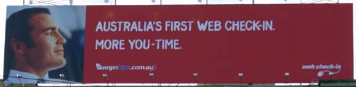
Ha! So, I’m going to claim it’s not my fault I misread it, and I’m going to do a geekrant about it, because now it’s a geek issue – look, it’s got web on it. And the fun part is, a few months after the ad went up I noticed it, but just as soon as I blog about it they pull it down. So you’re just going to have to take my word for it – the ad was up there. There’s a beer ad now.
What’s with that logo in the bottom-right corner? How does that add to the ad’s message? Why isn’t the VirginBlue in a more prominant location? Why did they change colours midway through the web address, and what’s with that aeroplane tail – are they intentionally making this hard to read? Or perhaps they’re making the name look like a plane – so why haven’t they added wings? And what does “me-time” have to do with the smirking idiot on the left hand side?
If you join the mile-high club after doing a web chicken, is that kinky?
What, more prominant than the DERAILED movie poster?
Mmmmm…. Chicken….
UI design or typography? 😉
We might be rotten at reading capitals but we’re good with jumbled words – so long as the
first and last letters are still in their proper place. Strangely enough that fact made no
difference in the famous case against French Connection UK’s logo – they still won and we
see the logo everywhere.
Peculiar creatures, aren’t we?