
I’ve ranted before about applications which decide to implement their own standards for colours. iTunes is the classic example. In order to make it look all cool and hip and skivvy-wearing-Apple-like, it has subtle shades of grey on the title bar to indicate (ha!) whether it’s active or inactive.
So I’ve been playing around with Office 2007, and now I find they’ve done the same damn thing.
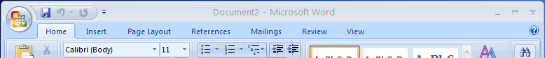
Here is Word 2007 when it’s active.
And here it is when it’s inactive.
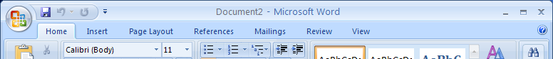
Actually, no, wait, I might have got those mixed up. Which is precisely my point.
WinXP’s default colour scheme gives me nice bold title bars, which clearly prompt me as to what’s got focus, and what hasn’t. Office 2007 overrides this, ignoring any preferences I might have set in Windows.
Digging around the Office 2007 help, and sure enough there is a way to change it. Well, almost. Well, not quite. Actually no, there isn’t. All they give you is the option of three different colour schemes: Blue (default, pictured above), silver (which is so close to blue it might as well be the same) and black.
Black, as it happens, gives the most contrast between active and inactive title bars. But it’s not only ugly, it also totally grates against every other window under the XP colour scheme. Do I have to change my XP colour scheme to be equally ugly just so I don’t have clashing window colours? The only benefit is it appears to almost match Media Player 11.
I know MS wanted to break the mould with Office 2007, to radically change the user interface. And I kinda like the big goofy buttons. But this bloody title bar thing is very, VERY irritating.
Now, not being critical but do you really need a colour to know when a program is active? I generally use the taskbar anyway and don’t look at the top of the screen.
Having said that, I found office 2007 to be a huge memory hog (even with 1gb of RAM). Maybe with my next PC but my 3 year old PC doesn’t need to look THAT attractive that I am prepared to put up with a 5 minute delay to open Outlook etc…
I’ve grown to prefer the Apple method of having one menu bar, that is always at the top of the screen, and changes depending on which window is active. It does away with the need for individual menu bars (which take up space) and active/inactive colours.
Randall: I guess every person is different in the way that they use the various prompts provided by the UI. One example is when using iTunes or Office 2007, and I go to close other (unused) windows, which don’t have the focus. In that situation, I mouse around looking for the X close buttons on greyed-out title bars, and invariably end up closing the windows I’m actually using, because they look the same. The confusion comes up in other instances, too.
I’m not fussed about MS and Apple tweaking the overall look of the applications, but I really object to them ignoring the Windows XP user colour preferences. The look they’ve adopted might look okay in Vista, but in XP, they should work like other XP applications. Not to mention people who need high-contrast colours due to eyesight issues.
In fact, MS themselves point out that while most of Office 2007 follows the Office colour scheme, “the toolbars, buttons, menus, and dialog boxes in Microsoft Office follow the Microsoft Windows desktop theme settings on your computer”. So even within Office it’s inconsistent!
I haven’t (so far) found Office 2007 to be a big memory hog. It does seem a little less responsive than Office 2003, but Outlook opens pretty quickly, so if you’re seeing long delays, something’s probably wrong.
The applications should, no *must* follow the settings made by the user
within the OS – be that Win 9x, XP or Vista. Colours, resolution, fonts, everything.
There may be real valid reason for those selections, beyond the simple personal
subjective assessment of “I prefer those colours”.
Consider the poor user who has colour blindness of some sort and cannot
tell apart colours provided within the new office? OR the one who, thro near
blindness, has their screen resolution set to 640 by 480, with, to me,
hideous fonts which makes it easier for them to see and read their screen? Are MS
suggesting that these poor users must make their UI setting changes in EACH
application rather than once in the OS?
For more than a decade, since before the release of Windows 3.1, MS has advised of
this need in their “good interface guidelines” documentations.
This new Office 07 breaks their own good advice. As do other applications.
Dave
Phillip – I still can’t get use to it. I can’t begin to tell you how many times I think the menu bar is for one app when it was in fact for another because I have a multitude of non-overlapping windows open. I’m just not used to adding that extra step of looking at the program title first. Even more confusing when I have multiple Word docs open 🙂 The change in the title bar design is helpful in apps like TextEdit, but in brushed-metal apps like iTunes and iCal, it’s near useless.
These ideas all worked when overlapping windows were the norm – but with the massive screens now where windows don’t have to overlap, we need new ideas.
Dave – I think the issue here is that the settings in XP do not correlate well with the Office UI design, e.g. the Office title bar colour is designed to be the same as the toolbar background; this is not the case in a standard XP app. It would be worse if they adopted certain colour settings, and not others I reckon. That said, accessibility could be a bit better.
As for breaking ‘interface guidelines’, everyone does it unfortunately, including Apple.
Sam I think those new ideas will appear with Leopard in two months. These huge screens weren’t available when Tiger was released but now they’re cheap.
arghh i understand completely When I use office 2007 on my main ‘at home comp” it’s like using an entirely new program. ffs I have gotten to teh stage where I;d rather use my work ntoebook or do anything at work at my station because they are both running office 2000/ saves me spending 5-10 mins looking for the rifght tab or setting to do it on my home computer.
Since probably Win 95, one of the first things I always did on a new computer was to go to appearance and change the title bar colour to fire engine RED. That way, I can find the wretched things. With Outlook, I’m forever “missing” the title bar when I go to move an e-mail window, because the thing looks just like everything in the sea of blue-grey below it. Even with two monitors, I overlap – main Outlook window, one or more open e-mails and an Explorer page or two which the e-mails refer to. By all means have a default pretty colour scheme, but let the user change it to ugly if they want to.
If you want ugly, a la “Windows Classic”, I can get you there:
1. In the Control Panel, open the “Accessibility Options”
2. Select the Display tab, check the “Use High Contrast” box
3. Click the “Settings” button, choose the “Windows Standard” theme”
4. Click OK and Apply the changes.
Voila, Office 2007 with a “Windows Classic” theme! The graphics are rough (low-res icons, no gradient shading), but everything’s functional.
Corporate tried to shove Office 2007 down my throat.
Bubble gum. It really looks pathetic next to my stark black mainframe sessions.
I tolerated office before.
Now, I’m just doing what I have told so many others.
openoffice.org
Ah. Jeff beat me to it.
Except that I use OpenOffice at home, on Linux.